What Is Pareto Analysis? a Manufacturing AI Priority Guide
What is Pareto analysis? Learn the 80/20 rule, how to build a Pareto chart, and use it to prioritize AI use cases that drive real ROI on the plant floor.
Written by AI for Manufacturing

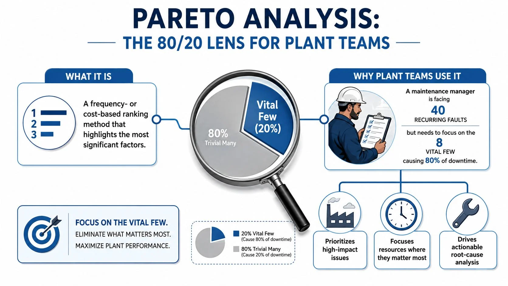
Pareto analysis is a frequency- or cost-based ranking method that sorts problem categories from largest to smallest impact and uses a cumulative curve to surface the small set of causes driving most of the loss. In the classic quality framing, about 80% of problems come from 20% of causes, and some real plant data skews closer to 90/10 rather than a neat split, so the point is to rank what hurts most, not to force every process into one ratio (JMP on Pareto charts; IEEE technical overview).
If you're staring at a maintenance board with 40 failure codes, 12 downtime buckets, and a budget for only one model this quarter, that's where Pareto analysis earns its keep. It gives you a defensible way to decide which defect classes, stoppage causes, or scrap reasons deserve attention first, before anyone asks data science to chase the long tail.
Table of Contents
- A Clear Definition and Why Plant Teams Use It
- From Pareto's Italy to the Factory Floor
- How a Pareto Chart Is Actually Built
- Recognizing 80/20, 90/10, and Other Patterns in Your Data
- Interpreting Results and Avoiding Common Pitfalls
- Using Pareto Analysis to Pick Manufacturing AI Use Cases
- Putting It Into Practice This Quarter
A Clear Definition and Why Plant Teams Use It
A plant team uses Pareto analysis to rank defect codes, downtime reasons, complaint types, or maintenance causes by frequency or cost, then plot the cumulative impact so the biggest contributors are obvious at a glance (ASQ on Pareto). On the floor, that means turning a long cause list into something people can act on, instead of arguing over every category with the same level of urgency.
A maintenance manager does not need another spreadsheet when the same failure codes keep showing up on every shift report. The key question is which three or four codes deserve a condition-monitoring model, a root-cause workshop, or a spares review. Plant teams use Pareto analysis before they fund an AI pilot because it separates the vital few from the trivial many before anyone spends time labeling data or tuning a model.
Pareto analysis is not the same thing as the Pareto principle
The Pareto principle is the familiar 80/20 rule, the idea that a small share of causes often drives a large share of outcomes. Pareto analysis is the working method that turns that idea into a ranked view of actual grouped data, which is why quality engineers and manufacturing analysts use it instead of relying on a slogan (Carnegie Foundation overview).
That distinction matters on the plant floor. A downtime taxonomy can look convincing in a meeting and still hide the true loss drivers once the events are grouped correctly. A chart built from observed counts or costs shows whether a handful of failure modes really dominate the downtime burden, or whether the pattern is flatter than the team expected.
If the chart changes what you fund, it is doing its job.
For AI teams, this is the screening step. Use Pareto analysis to decide whether a vision model, a predictive maintenance pilot, or a process-control project has enough impact behind it to justify the build. It keeps model selection tied to the loss categories that matter, instead of spreading effort across defect classes or anomaly types that will never move the needle.
From Pareto's Italy to the Factory Floor

The idea began as an observation about unequal distribution
Vilfredo Pareto's late-19th-century work is the reason this method exists at all. Later summaries of his research report that about 80% of Italy's land was owned by 20% of the population, and that in 1906 he described roughly 20% of the population owning 80% of the property (PMC historical summary). Joseph M. Juran later generalized that pattern into the 80/20 rule that quality teams still use in problem-solving and process improvement.
That history matters because the method came from an empirical pattern of concentration, not from a charting trick. On the factory floor, the same shape appears in defect codes, downtime buckets, rework, and supplier issues. A press line may keep logging “mechanical stop,” “sensor fault,” and “operator wait” in equal detail, yet one or two codes often carry most of the lost hours once the events are grouped correctly. The point is not that every plant must fit 80/20. The point is that concentrated loss shows up often enough to justify ranking causes before anyone spreads effort evenly across the whole problem set.
The ratio is a starting hypothesis, not a law
Plant teams often repeat 80/20 as if every process must land there. Real operations do not stay that tidy. Technical sources note that the exact split varies by process, and some fault-analysis settings are closer to 90/10. In practice, the useful move is to inspect the curve you have.
A steeper skew means the top few categories dominate even more strongly. A flatter curve means the problem is more distributed and may need broader process work instead of a narrow model. That is the screening step for manufacturing AI. If a handful of defect classes, downtime causes, or process anomalies dominate the loss, those are the cases worth building a vision model, predictive maintenance pilot, or process-control model around. If the ranking is flat, the team should be cautious about assuming one model will move the whole plant.
If the curve is steep, prioritize aggressively. If it's flat, do not pretend one model will fix the whole plant.
The method is still useful because it tells analysts where to look first. On the factory floor, that means deciding which loss categories deserve deeper data collection and which ones should stay on the backlog, which is why the quality engineering version of Pareto analysis is still one of the cleanest filters before AI model selection.
How a Pareto Chart Is Actually Built
Start with one measurement, not three mixed together
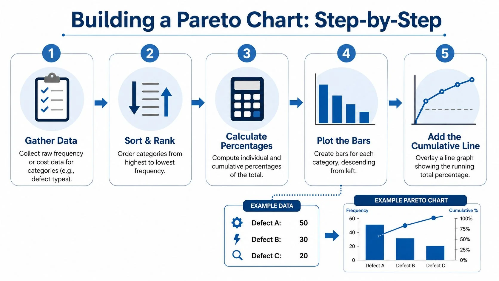
A Pareto chart sorts categories in descending order by one quantitative measure, then adds a cumulative percentage line that ends at 100% (Domo on Pareto charts). In a plant setting, that measure can be defect count, repair hours, cost, or downtime time, but it needs to stay consistent across the chart. Mixing defect counts with repair hours on the same axis makes the ranking misleading.
The cleanest version starts with a narrow question. For example, if your concern is unplanned stops on Line 3, use downtime minutes or hours only. If your concern is scrap, use scrap cost or scrap count only. Once the measure is fixed, group your categories into a workable list, sort from largest to smallest, and calculate each category's share of the total.
Use the cumulative curve to expose the break-point
The chart's real value comes from the cumulative line. As bars stack from left to right, the line shows how quickly the total accumulates. When that line crosses the 80% reference point, you've found the point where the vital few have captured most of the loss, which is why formal Pareto diagrams often include that threshold line (SARS R&M manual).
A simple defect-code example works well on the shop floor. If defect codes are sorted by frequency, the biggest bars tell you where the defect burden sits, and the cumulative line tells you how many codes you need to address before you've covered most of the issue. That is the audit trail operators and supervisors trust, because they can see both the ranking and the running total.
For data prep, a clean collection process matters as much as the chart itself. If the event log is messy, the ranking will be messy too, which is why disciplined data collection is worth doing before the charting step (internal guide on manufacturing data collection).
Choose the time window on purpose
Time windows change the story. A quarter is often a practical starting point because it's long enough to capture recurring issues and short enough to stay relevant after maintenance actions, staffing shifts, or recipe changes. If you include a seasonal shutdown or a one-off launch period, you may be ranking a temporary disturbance instead of a stable process pattern.
A Pareto chart is only as defensible as the window and the taxonomy behind it.
That's why the mechanics matter for AI work. Before you label data, train a classifier, or pitch predictive maintenance, you need a ranking that operations leadership can defend in a review meeting.
Recognizing 80/20, 90/10, and Other Patterns in Your Data
Common Concentration Patterns in Manufacturing Data
| Pattern | Typical Cause Share | Typical Impact Share | Where It Often Appears |
|---|---|---|---|
| 80/20 | A moderate number of categories dominate | A small group drives most of the loss | General defect, downtime, and complaint ranking |
| 90/10 | Very few categories dominate sharply | One or two causes can account for most impact | Fault analysis, highly concentrated downtime, narrow bottlenecks |
| 70/30 | Impact is still skewed, but less extreme | The tail matters more than in a steeper curve | Mixed-loss environments, early process learning, broader service issues |
The value of this table is practical, not academic. A plant with a 90/10 shape has an even stronger case for attacking the top few causes first than a plant with a textbook 80/20 shape. A 70/30 shape says the tail deserves more respect, because the loss is less concentrated and the second tier of categories may still matter.
Read the curve before you decide what matters
The most common mistake is assuming the shape before the chart is built. Teams hear 80/20, then look for confirmation instead of evidence. The better habit is to compare the cumulative curve against the ranking and let the data tell you whether the steepest part sits early, middle, or late in the list.
If the first few bars cover most of the curve, the best action is usually narrow and aggressive. If the curve climbs more gradually, the plant may need a wider improvement program, not just a single-model fix. That distinction changes AI prioritization, because a steep curve can justify a focused pilot, while a flatter one may need a broader data strategy first.
The other benefit of recognizing the pattern is governance. Steering teams stop arguing about whether the organization “is an 80/20 shop” and start asking a better question, which categories drive the current loss profile. That keeps the discussion grounded in observed plant behavior instead of folklore.
Interpreting Results and Avoiding Common Pitfalls
The chart fails when the taxonomy is sloppy
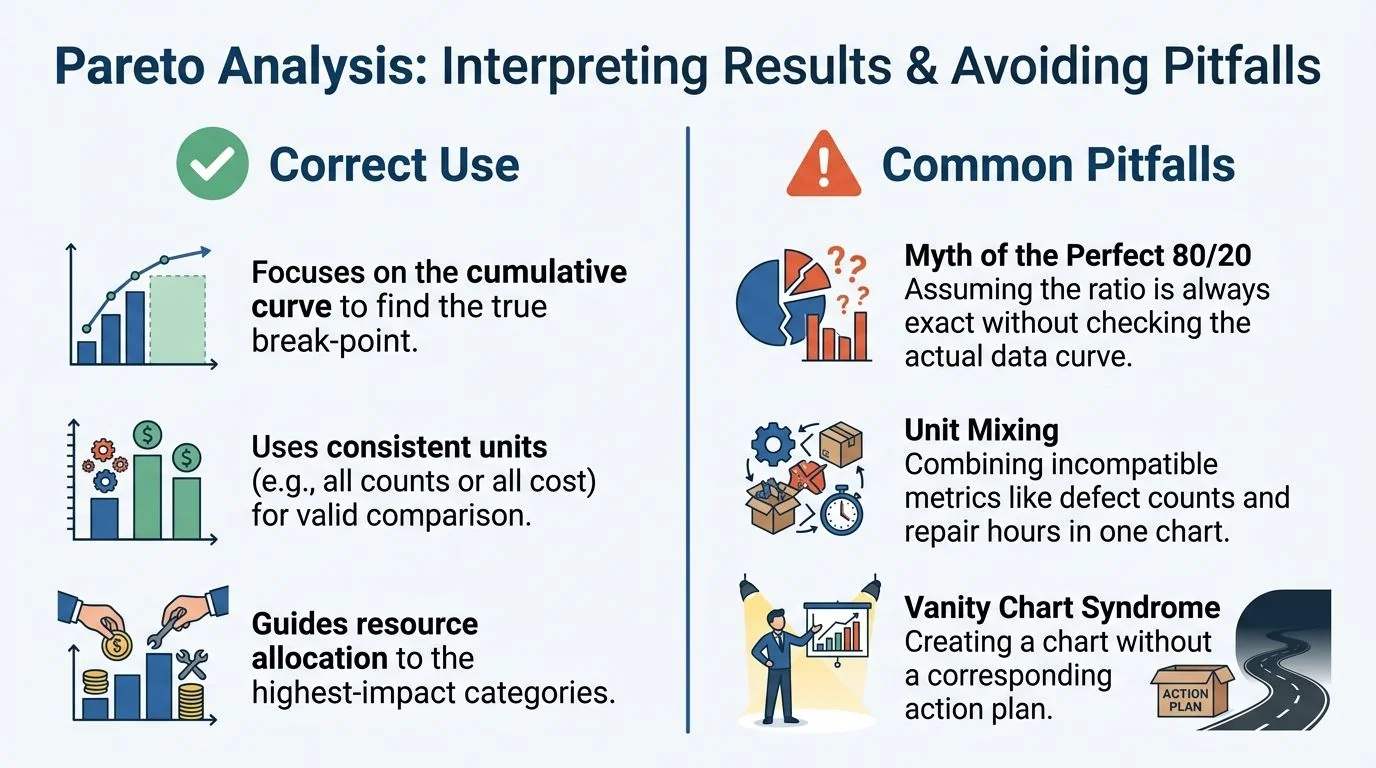
A Pareto chart can look polished and still be wrong. The first failure mode is assuming 80/20 before checking the cumulative curve. The corrective move is simple, inspect the curve and rank the actual categories in front of you, not the split you hoped to see.
The second failure mode is unit mixing. If one bar represents defect counts and the next represents repair hours, the chart stops being a clean ranking of impact. Recompute the chart on uniform cost units, or build separate charts for separate decisions. In plant reviews, that difference separates a prioritization tool from a vanity slide. The same caution applies when teams pull category names from a weak defect taxonomy. If the labels are inconsistent, the ranking can point in the wrong direction. A clean category structure belongs with the rest of your manufacturing quality metrics, and it is easier to defend when the taxonomy maps to the way operators, maintenance techs, and quality engineers record the loss.
The third failure mode is treating the tail as harmless noise. In manufacturing, the long tail can hide systemic risk, especially when a rare failure mode has severe consequences or when several small categories point to the same root cause. Audit the tail before discarding it, then re-rank after any major process change so the chart reflects the current operating state.
Corrective habits that keep the chart honest
- Use one decision metric: Keep the ranking on counts, cost, or downtime, not a blend of all three.
- Check the break-point visually: Do not rely on the headline ratio alone, because the cumulative curve shows where the loss really concentrates.
- Review after process changes: Re-rank after maintenance overhauls, product mix shifts, or control logic changes.
- Keep the tail under review: Some low-frequency categories deserve action because they signal risk, not because they dominate volume.
Pareto charts are built to guide action, not to decorate a deck. If there is no corrective action tied to the ranking, the chart is just a picture with bars on it.
Using Pareto Analysis to Pick Manufacturing AI Use Cases
Use the ranking to decide what gets a model first
Pareto analysis becomes especially useful when the plant has more AI ideas than budget. Rank downtime causes first, then ask which categories are large enough to justify a predictive maintenance pilot, which defect classes are large enough to justify a vision model, and which yield-loss modes are large enough to justify process control. That is a much better starting point than asking the data team to “find something interesting” across the entire historian.
A practical example is a site that ranks downtime categories and finds that two causes dominate the hours. Those two categories become the first candidates for deeper analysis, because they already have the clearest payoff signal. If the problem is repeated bearing failures, the pilot may lean toward vibration-based predictive maintenance. If the problem is surface defects, the pilot may lean toward image inspection. The Pareto step doesn't choose the model for you, but it tells you which problem is worth modeling first.
Use documented implementations to validate the shortlist
Once the vital few are known, compare them against documented manufacturing AI implementations. That's where a database like the predictive maintenance use case library becomes useful, because it helps you check whether a prioritized loss category has a proven AI pattern behind it. The point isn't to copy another plant's setup. The point is to avoid inventing a pilot from scratch when the problem already has a known implementation class.
This bridge matters because many AI programs fail at the selection stage, not the modeling stage. Teams pick weak use cases, spread attention across too many categories, and then wonder why the pilot never clears the operations bar. Pareto ranking reduces that risk by turning a noisy list into a short queue of evidence-backed candidates.
A good AI backlog starts with a chart, not a vendor demo.
That's the shift from classical quality engineering to manufacturing AI. Pareto analysis is the screening step that decides where machine learning belongs, where simple process control is enough, and where the plant should leave the problem alone for now.
Putting It Into Practice This Quarter
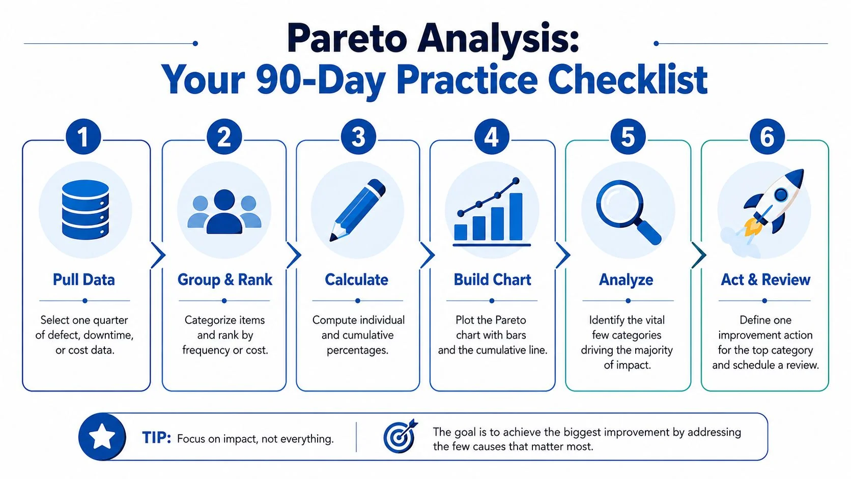
Run this in six steps. Pull one quarter of defect, downtime, or cost data. Group and rank the categories. Calculate each category's share and cumulative total. Build the chart with a descending bar order and cumulative line. Analyze the vital few. Act and review one chosen improvement path, then re-rank after the change.
Keep the checklist tight. If the chart points to a few high-impact downtime causes, use that list to narrow AI use cases instead of opening a broad analytics program. If the curve is flatter, treat that as a signal that the problem needs more process work before modeling.
The next move is simple, take the ranked loss categories and compare them with documented implementations in the AI for Manufacturing dataset before you commit budget. That gives you a cleaner bridge from plant data to an evidence-backed AI roadmap, and it's the fastest way to turn Pareto analysis into a manufacturing AI decision tool that holds up in front of operations leaders.
